
One set of standards, that makes your product stand out.
The visual rules that make your brand's Smart PPE™ stand out from the crowd, whilst demonstrating the new standard of safety that is built in using Scannable. Follow these guidelines to make sure your packaging, marketing communications, and branding consistently show up in the market as intended.
The Partnership
Powered by Scannable
The lockup that lives on your packaging and marketing. Tells the buyer this item connects to the Scannable system. This is what your brand carries — not ours.



The product category
Smart PPE™
Any PPE - helmets, harnesses, ropes, lanyards – that ship with Scannable technology embedded. The category name. Use it to describe what the product is.








The company
Scannable
The business behind the standard. Use when attributing the technology or referring to the system itself. Never used as an adjective for your own product.




















Co-branding rules
Working together. Never competing
Powered by Scannable lives next to your brand on packaging, never on top of it. Match the lockup height to your wordmark's x-height, separated by a hairline rule. More clearspace is always better.
Background pairing

Dark background
Use the light / outline variant.

Light background
Use the dark / solid variant.
Clearspace

No other logos, type, or rules inside the exclusion zone. More clearspace is always better.
- Print minimum16 mm wide for the horizontal lockup. Mark-only: 8 mm.
- Digital minimum96 px wide for the horizontal lockup. Mark-only: 24 px.
Don't do this
Don't rotate.
Always upright, never angled.
Don't stretch or squash.
Proportions are fixed — never distort.
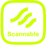
Wrong variant on light.
The lime outline mark disappears on light backgrounds.
Colour
Scannable brand colours
Four primaries carry the brand, supported by three secondaries. Use these values exactly — never substitute or approximate.
Primary
Lime
#CCFF00
Signature · CTA · logo accent
Primary Purple
#2F205B
Wordmark · text on Lime · dark CTAs
Dark Purple
#201B30
Dark surfaces · backgrounds
Black
#000000
Specific Brand Kit applications
Secondary
White
#FFFFFF
Dominant web/digital surface
Lavender
#CAA8F5
Soft accent · section backgrounds
Bright Purple
#5A43DD
Purple-blue highlight
Typography
One typeface. Five sizes.
Headings
Helvetica Now Display
All three heading sizes
Used for all headings. One weight per headline — don't mix weights within a single line for effect. Sentence case always.
Body
Helvetica Now
All body copy · UI labels
Big copy (16px) is the default for any primary reading text. Regular copy (10px) for captions and fine print only — never for content read at length.
Type scale
Sentence case for all headings — never Title Case or ALL CAPS. Left-aligned always, except single-line hero moments. Body copy max 65–75 characters per line.
Photography
Real content in real places. No stock or AI generated imagery
Honest light
Daylight, overcast, or single-source studio. No drama lighting or HDR.
Real environments
Sites, workshops, vehicles. Never a white cyclorama unless it's a pure SKU shot.
Smart marking visible
Where possible, try to showcase the label, tag, or 2D code – don't force it, capture it naturally.
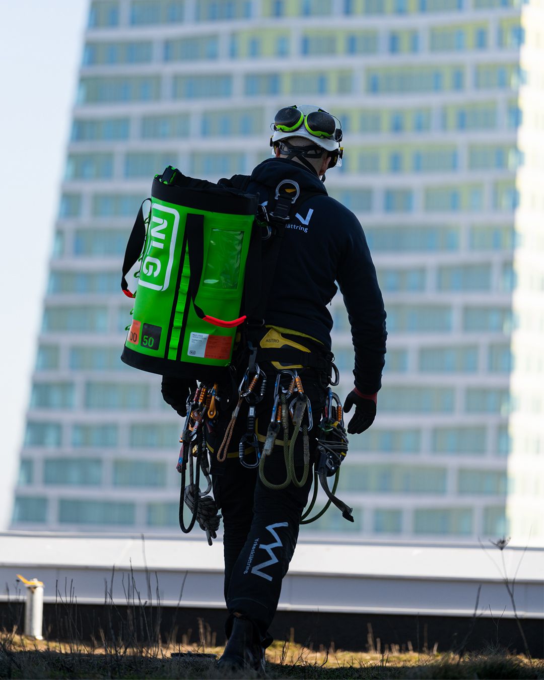 1Hero — Smart PPE™ product in environment. Use wide angle or ultra-wide angle to capture the whole environment and context.
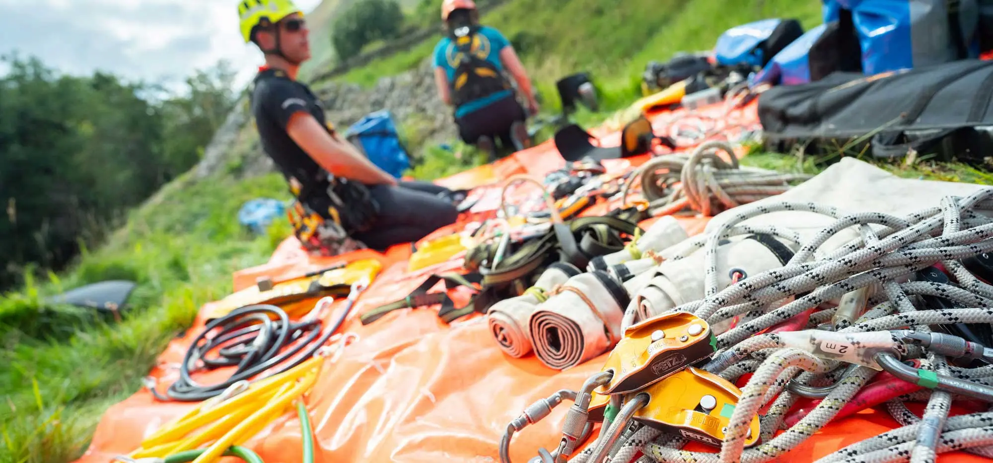 2Kit shot — multiple items, real gear, showing scale and quantity. This can be shot in the field, on the factory floor, or in a training centre – the key is capture a shot that covers more than just one piece of Smart PPE.
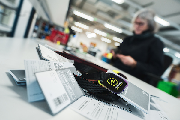 3Tag detail — A close up of the Scannable tag integration, with the label legible or smart marking clear. Or show the product coming off the product line with the Scannable branding – making the Smart PPE labels a focal point.
 4Wearer Portrait — Another shot from the field. Show Smart PPE being used in context. This time add the human element looking at the camera.
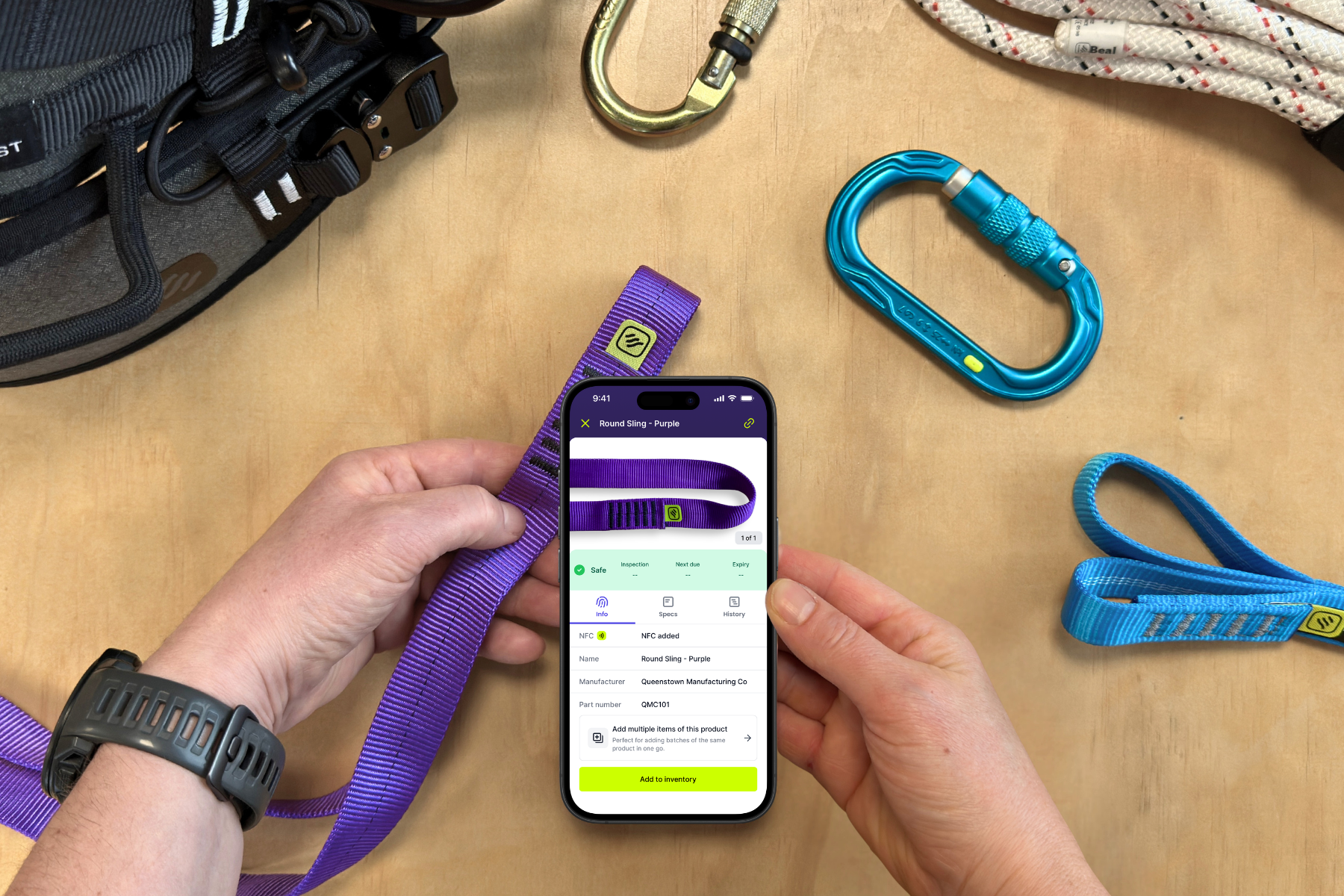 5The tap — phone within 2 cm of the chip, hand visible, screen showing the read. Can be staged or from the field – either works, this is about celebrating the app.
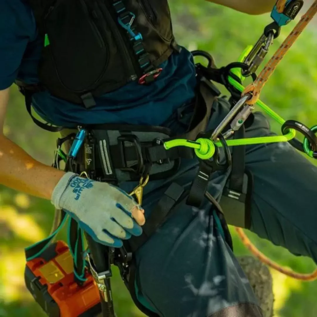 6Item close up — Close up of item in use, showcase the product if it's being used with other equipment. Real environment, real use.
Something missing?
Can't find what you need?
If something you’d like isn’t there — or you’re not sure which one is right for your application — ask us and we’ll help you out.
Get in touch